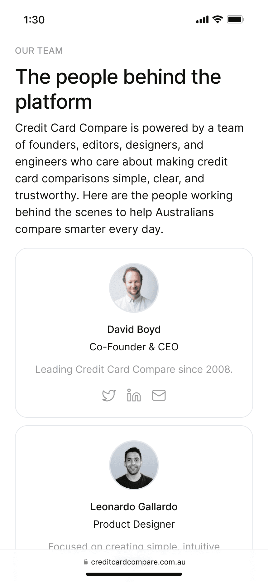
Credit Card Compare
About
Credit Card Compare helps Australians find and apply for the right credit card, without the second-guessing.
Client
Boyd Creative Australia Pty Ltd
Year & duration
2025
-
Ongoing
Role
Senior Product Designer. End-to-end redesign for market re-entry, from problem framing through delivery, working directly with founders, engineering, and compliance.
Why this case study
This is the most complex decision-design problem I've worked on. Most comparison tools treat the problem as information architecture: show more data, add better filters. I diagnosed it differently. The experience never helped users decide, and no amount of extra data was going to fix that. This case study shows how I reframed the entire product around that insight and built three tools to replace a single broken flow.
At a glance
End-to-end redesign, solo ownership from problem framing to delivery
Three UX tools, each designed for a different stage of the decision
Prototype testing validated the core decision-design shift
Full bank alignment secured before launch, no commercial renegotiation needed
~60%
Faster decision time
3
Purpose-built decision tools
200+
Cards funneled to one shortlist
Why wasn't it converting?
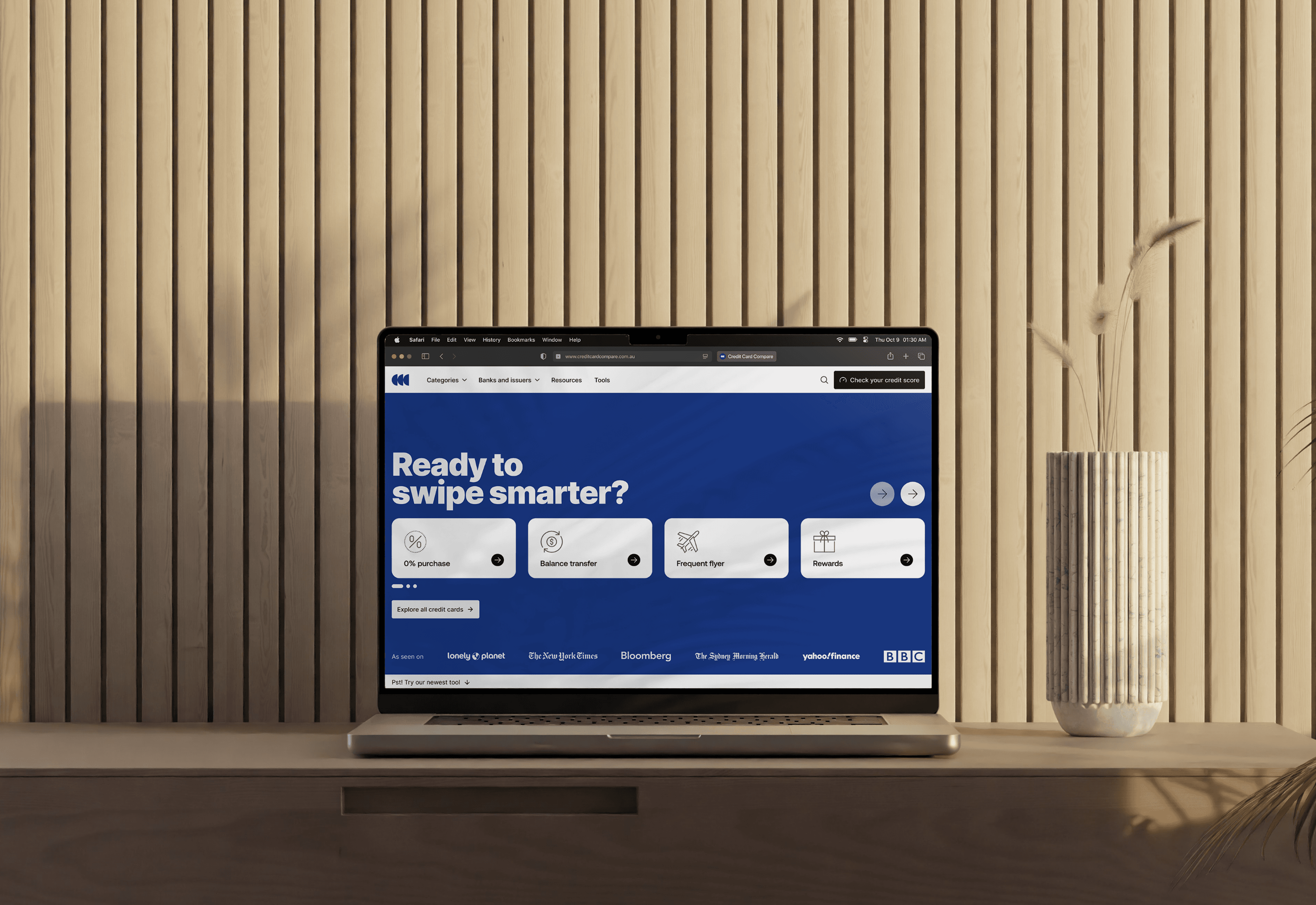
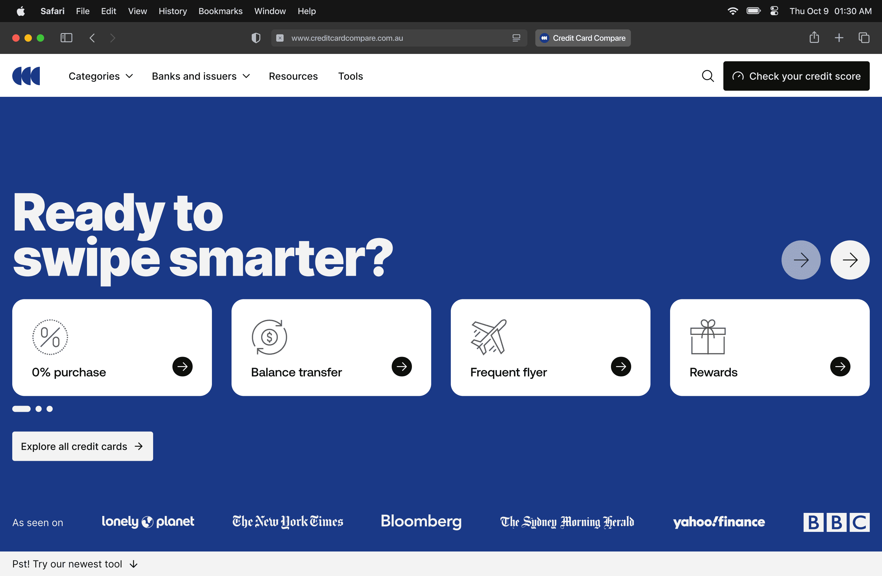
Credit Card Compare re-entered the Australian market after years away, walking into a space where every competitor was solving the same problem the same way: more cards, more filters, more data.
Users were landing, browsing, and leaving.
The assumption was that they needed more information, but they needed something to help them decide.
More options weren't the answer.
What does deciding actually look like?
Help Australians find and apply for the right credit card with confidence. Fewer drop-offs, higher-quality applications, users who felt certain about their choice and not just informed.
You can give someone every detail about every card and still leave them paralysed.
Certainty comes from structure, not volume.
The real goal was to remove the work of deciding from the user and put it into the design.
Where was it breaking down?

What if we designed for the decision?
Most comparison tools design for browsing, one continuous flow where you scroll, filter, and hope something stands out.
I reframed the journey around deciding instead, breaking it into three distinct stages:
Finding the right category
Evaluating similar cards
Committing with confidence
Recognizing these as separate design challenges shaped the entire product direction. Each stage had a different job. The challenge was connecting them into something that felt like one experience.
Move from data to answers.
The guiding principle

Three tools, why not one?
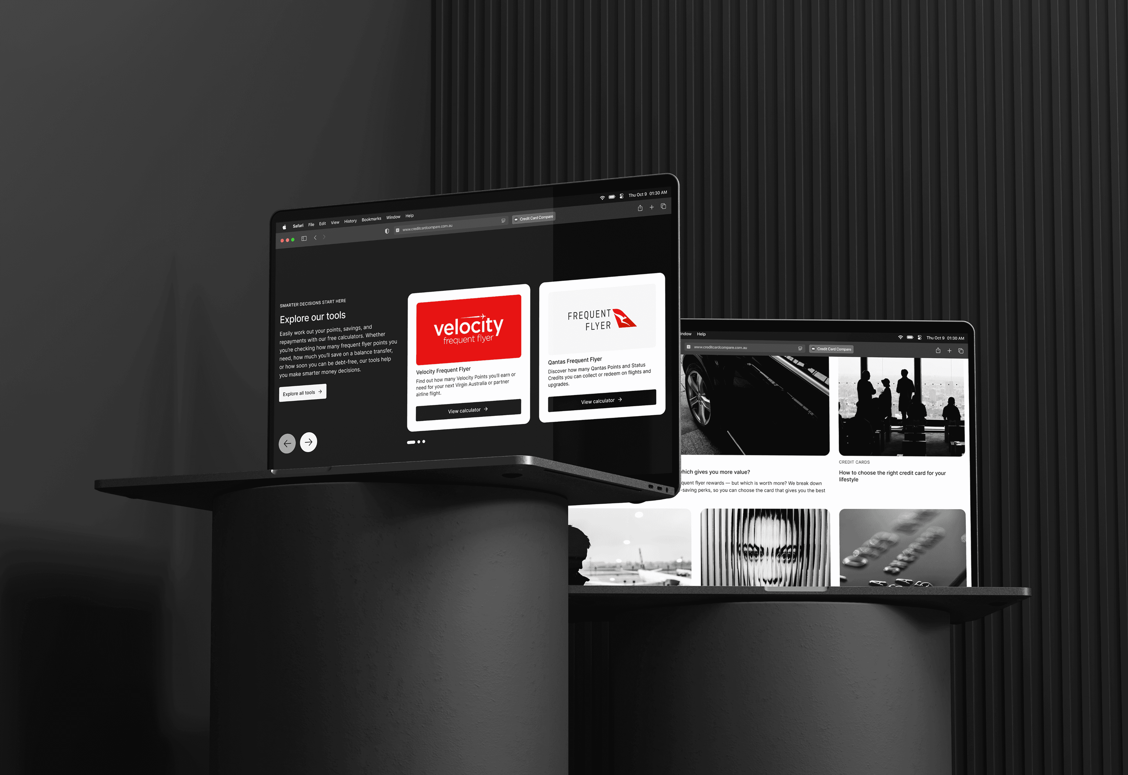
I designed three tools to shift users from browsing to deciding.
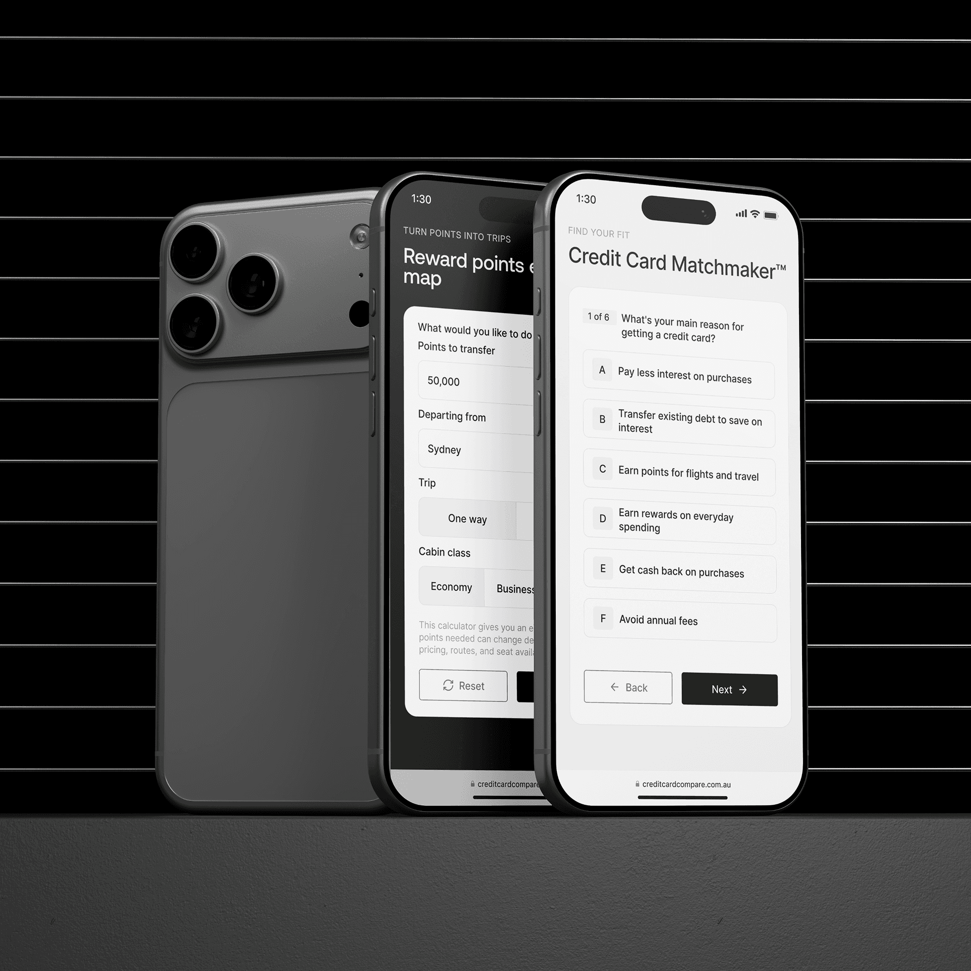
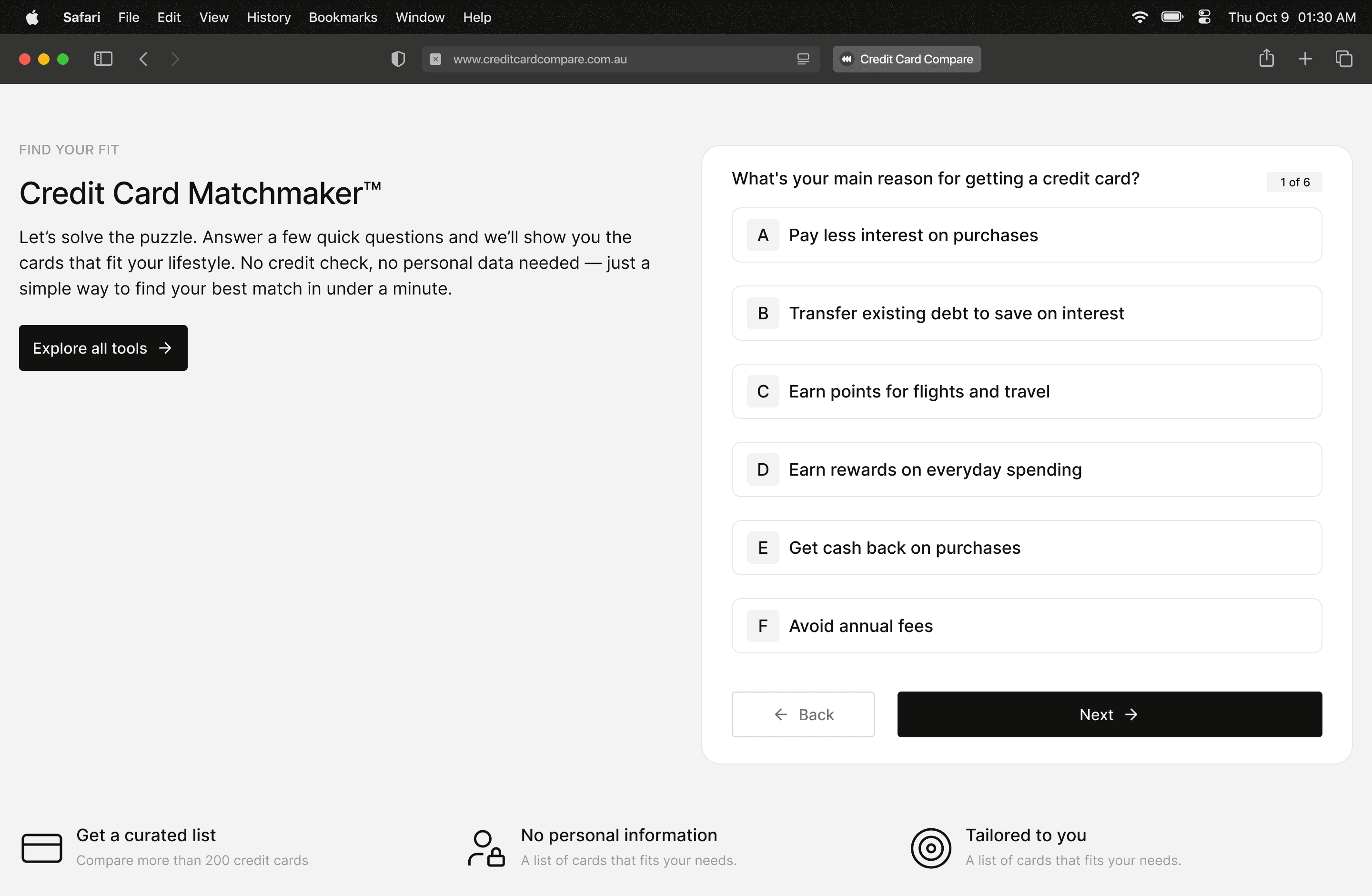
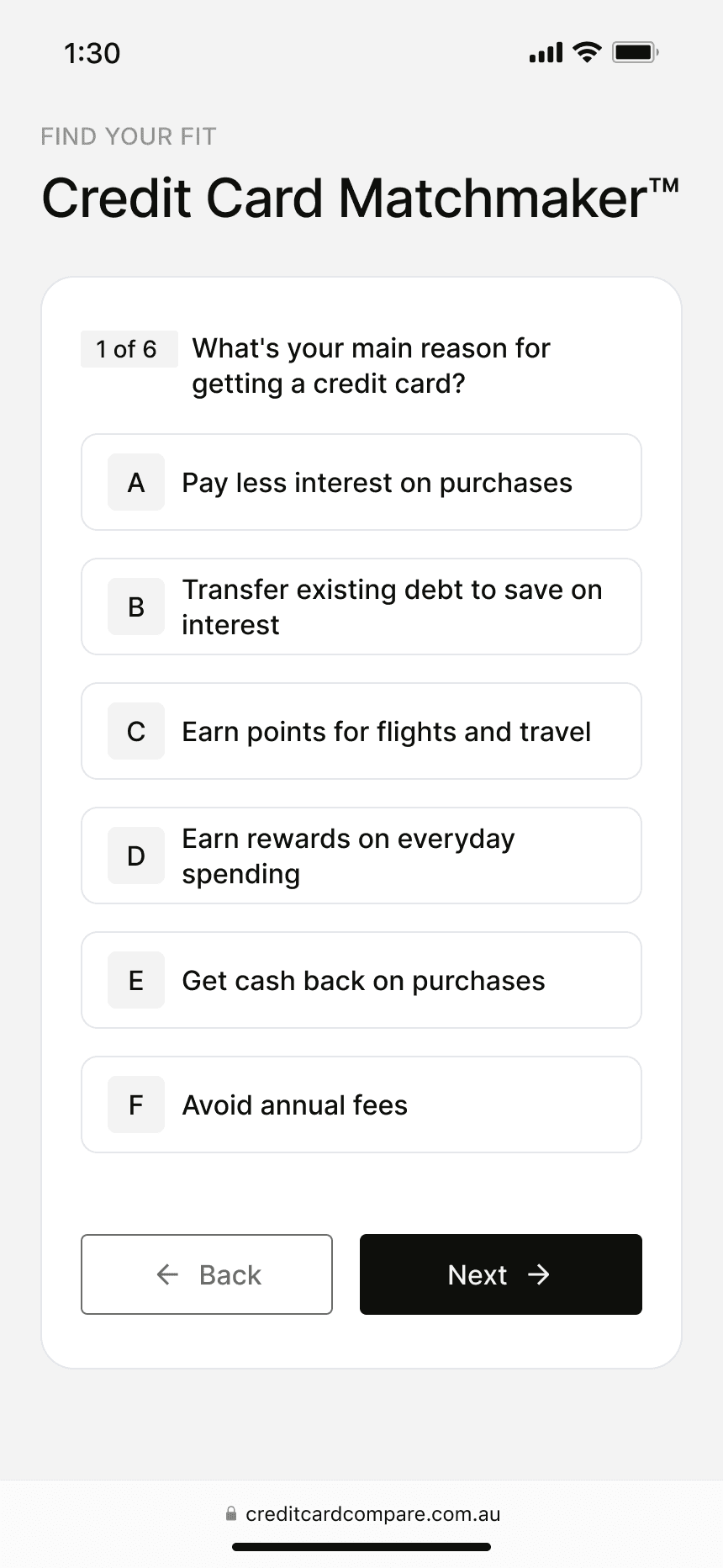
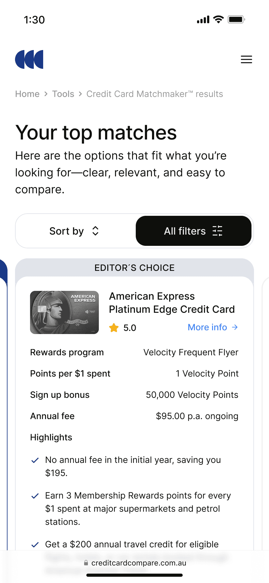
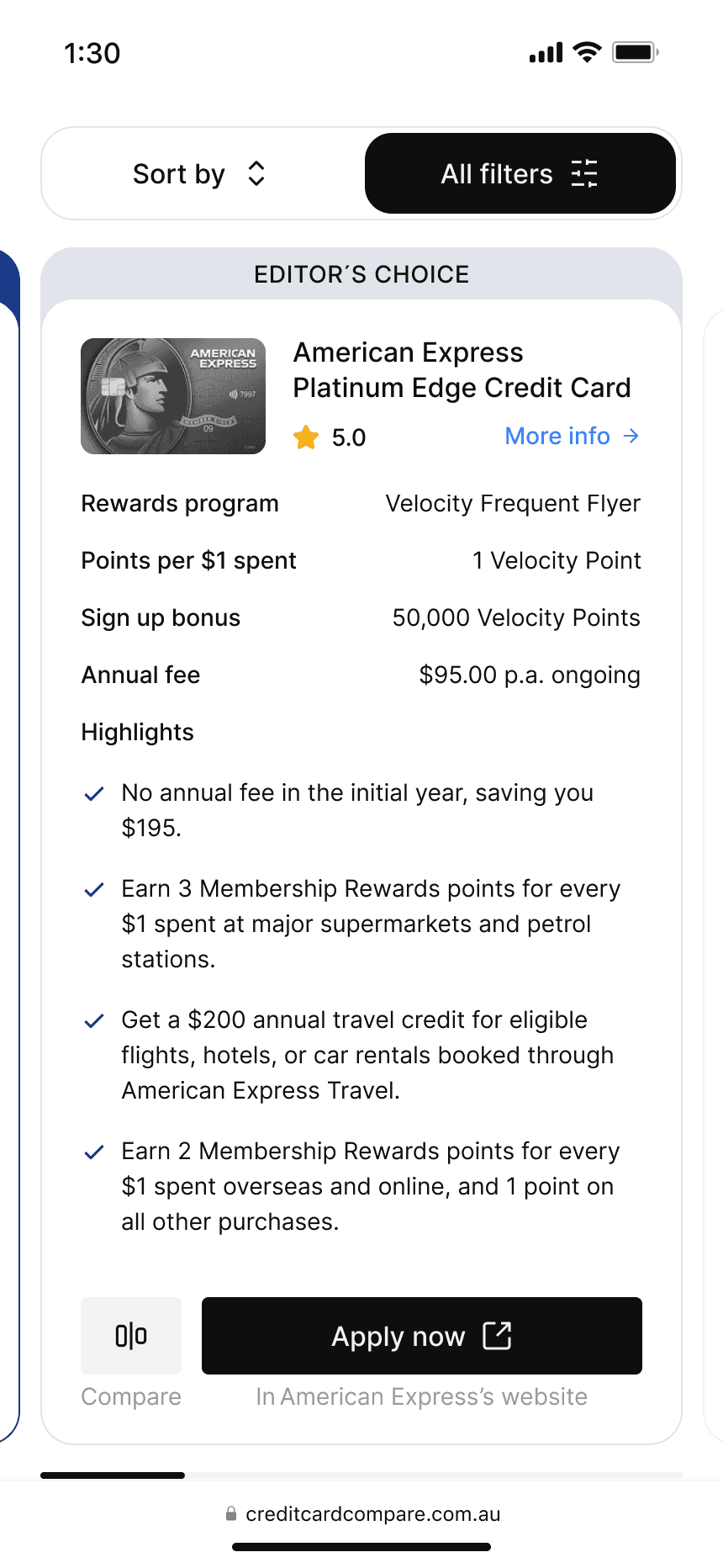
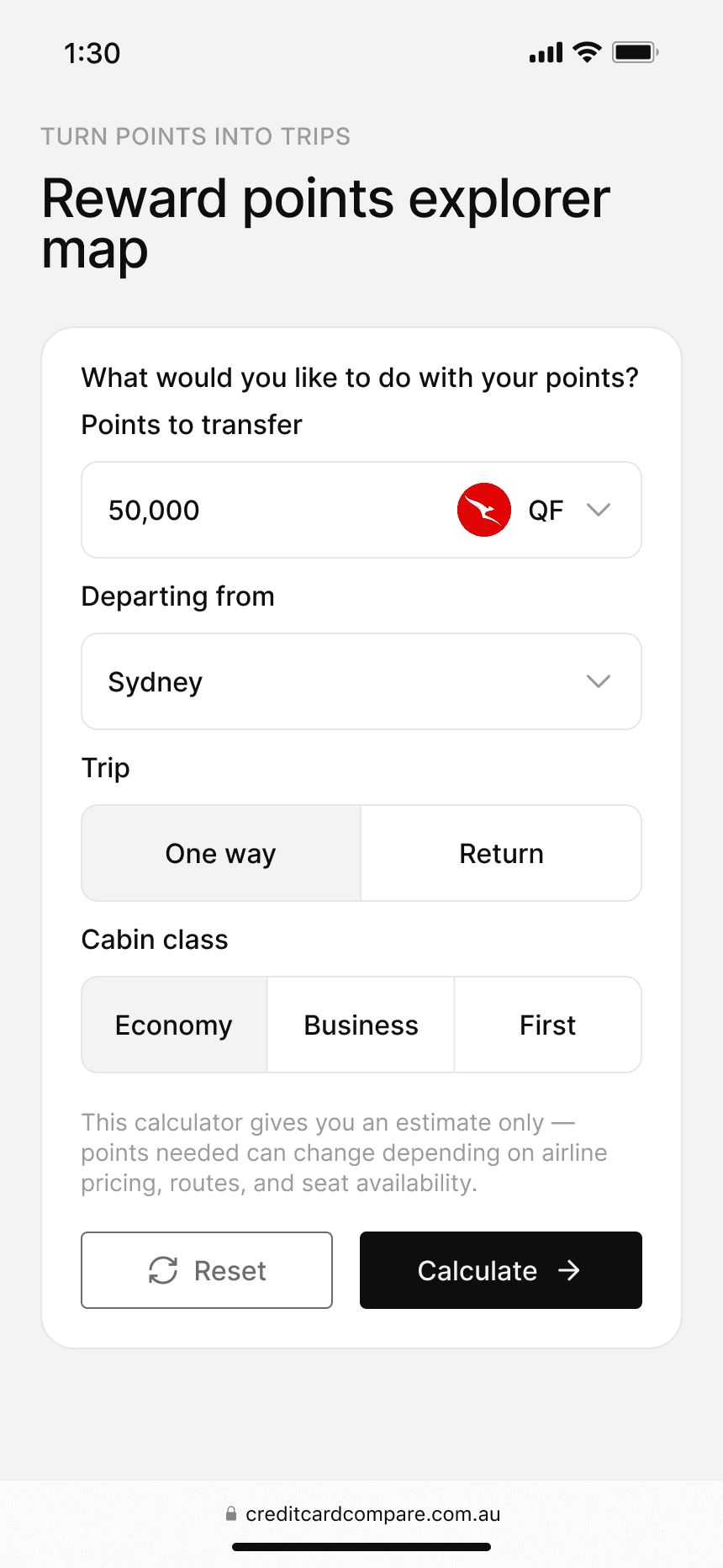
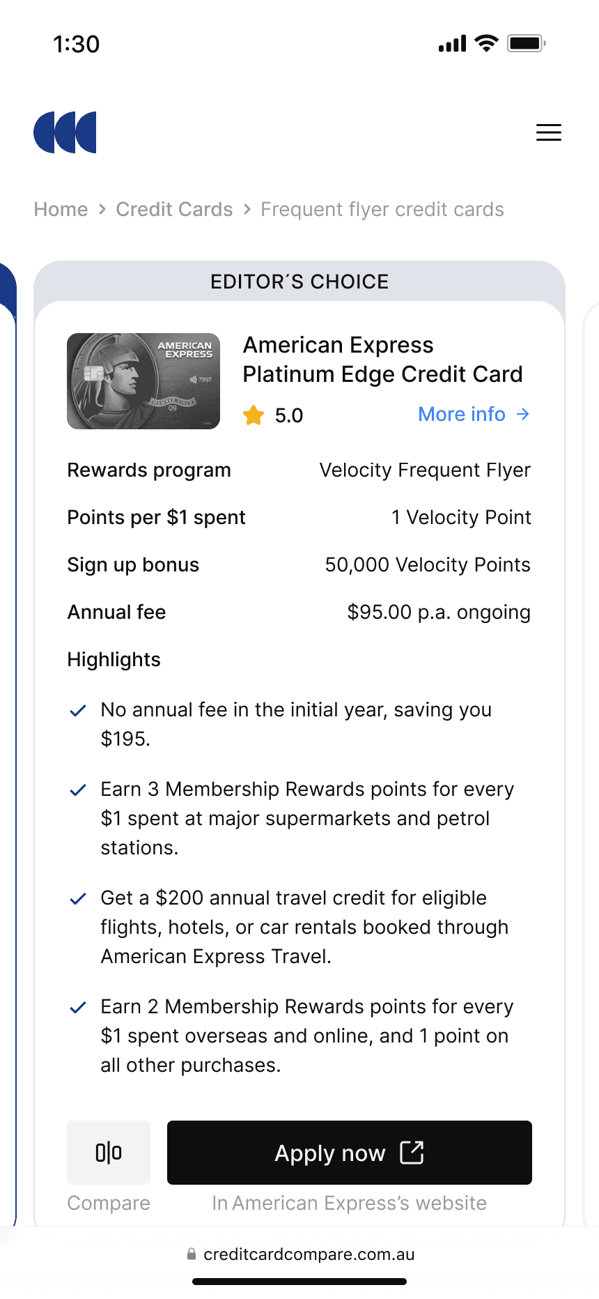
Credit Card Matchmaker collects user needs through guided questions and returns a curated set of cards, reducing category page reliance but requiring banks to accept fewer featured placements. I made the case that curation would outperform volume, and the business backed it.
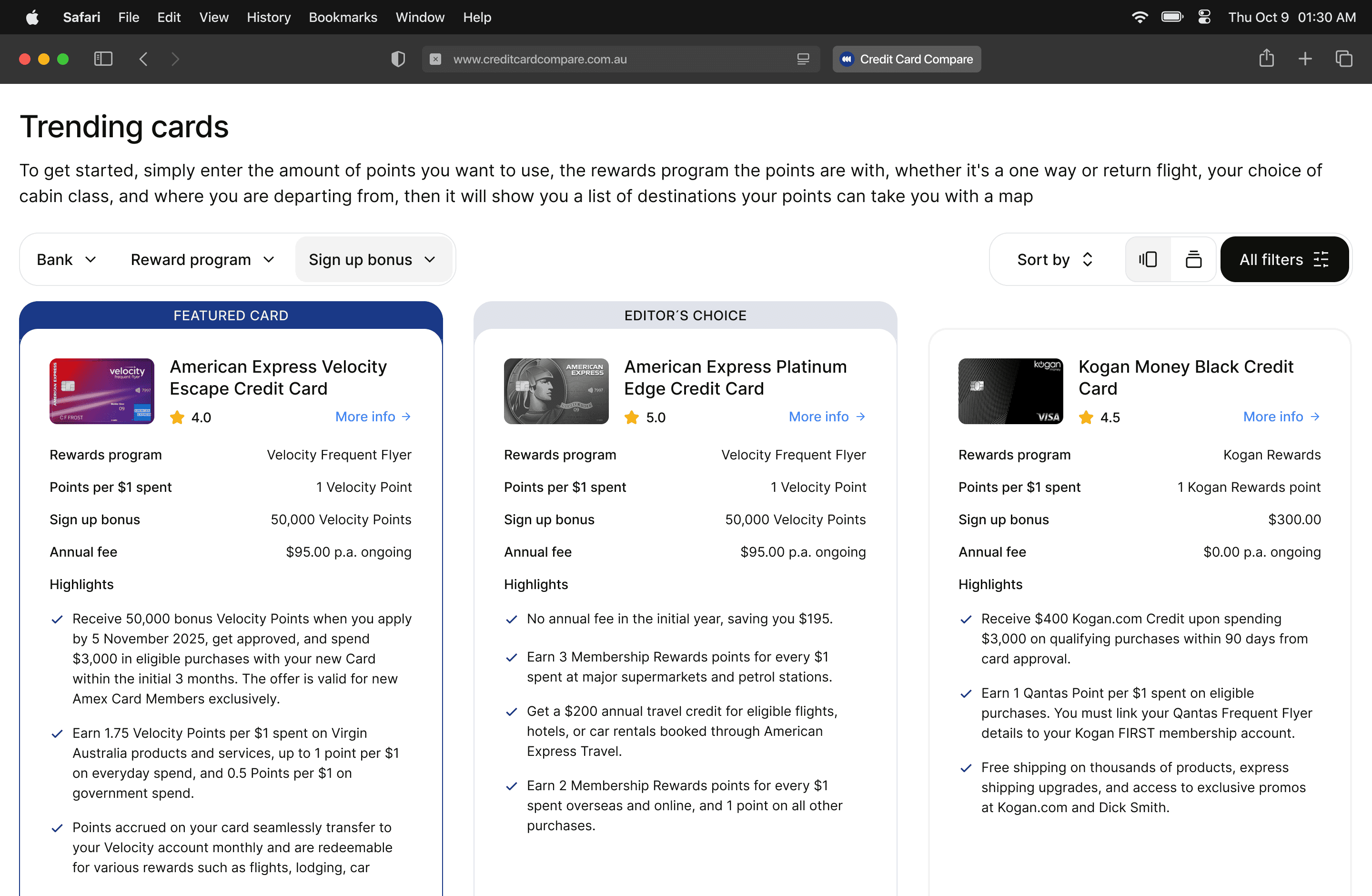
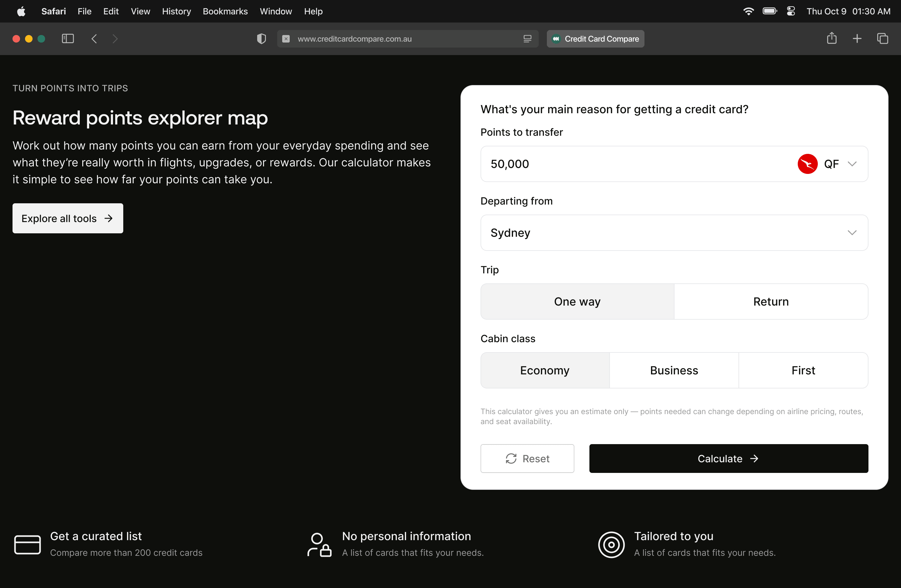
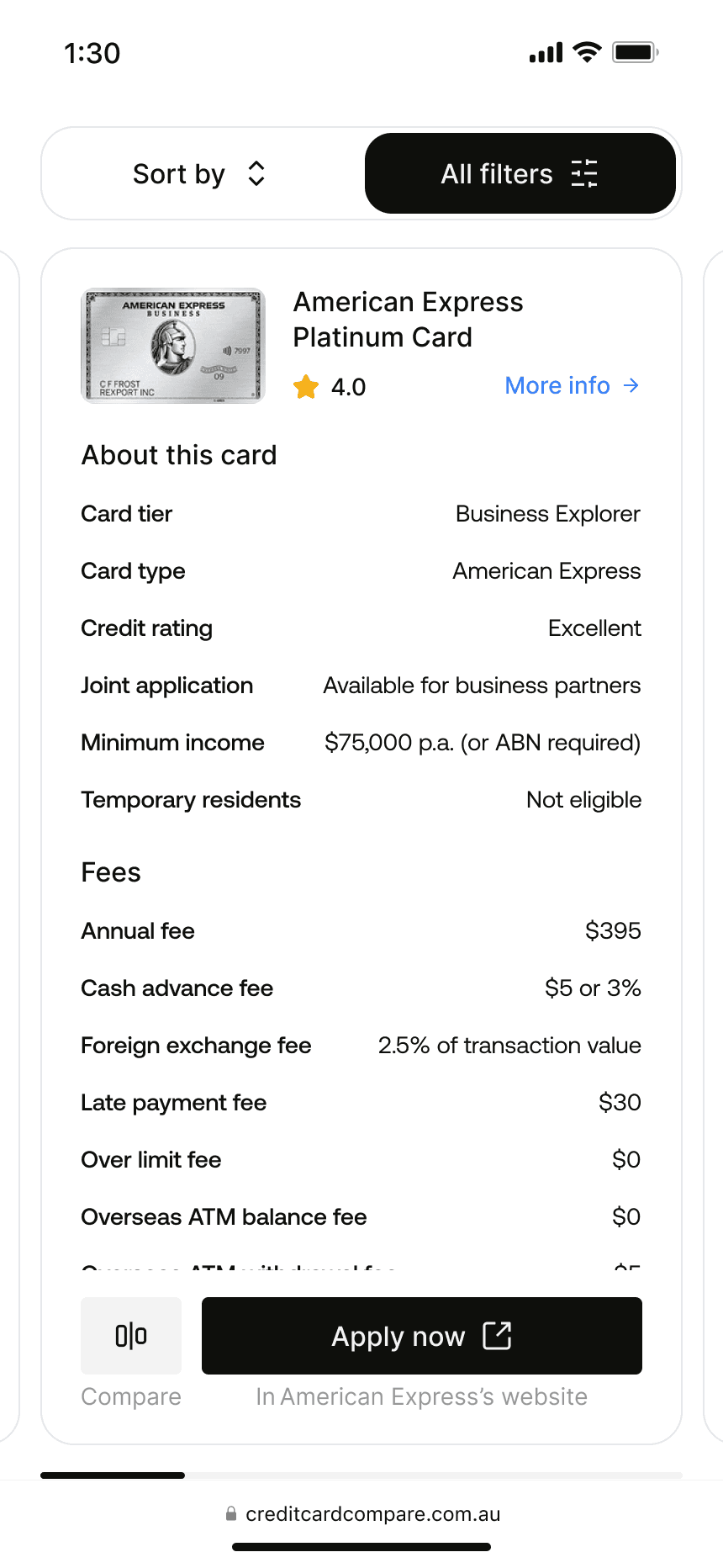
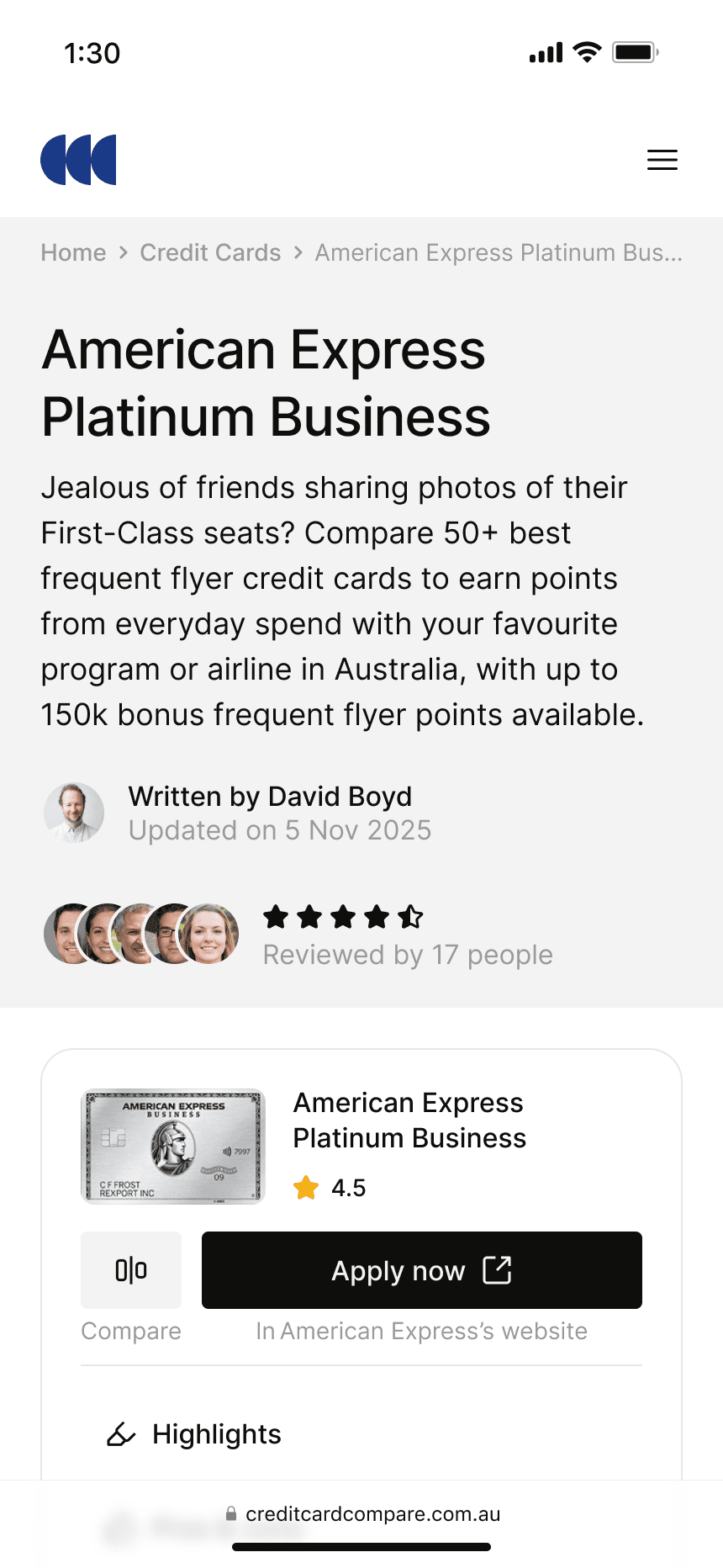
Side-by-side comparison presents fees, rewards, and transfers at the same visual level to simplify evaluation, enforcing stricter data standards and pushing back on inconsistent bank submissions.
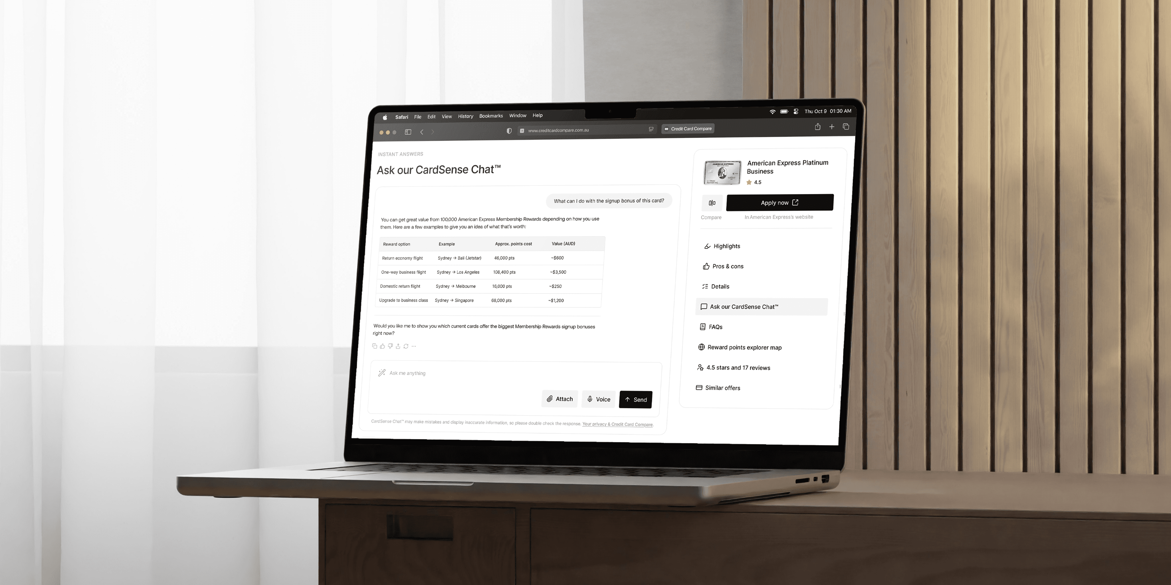
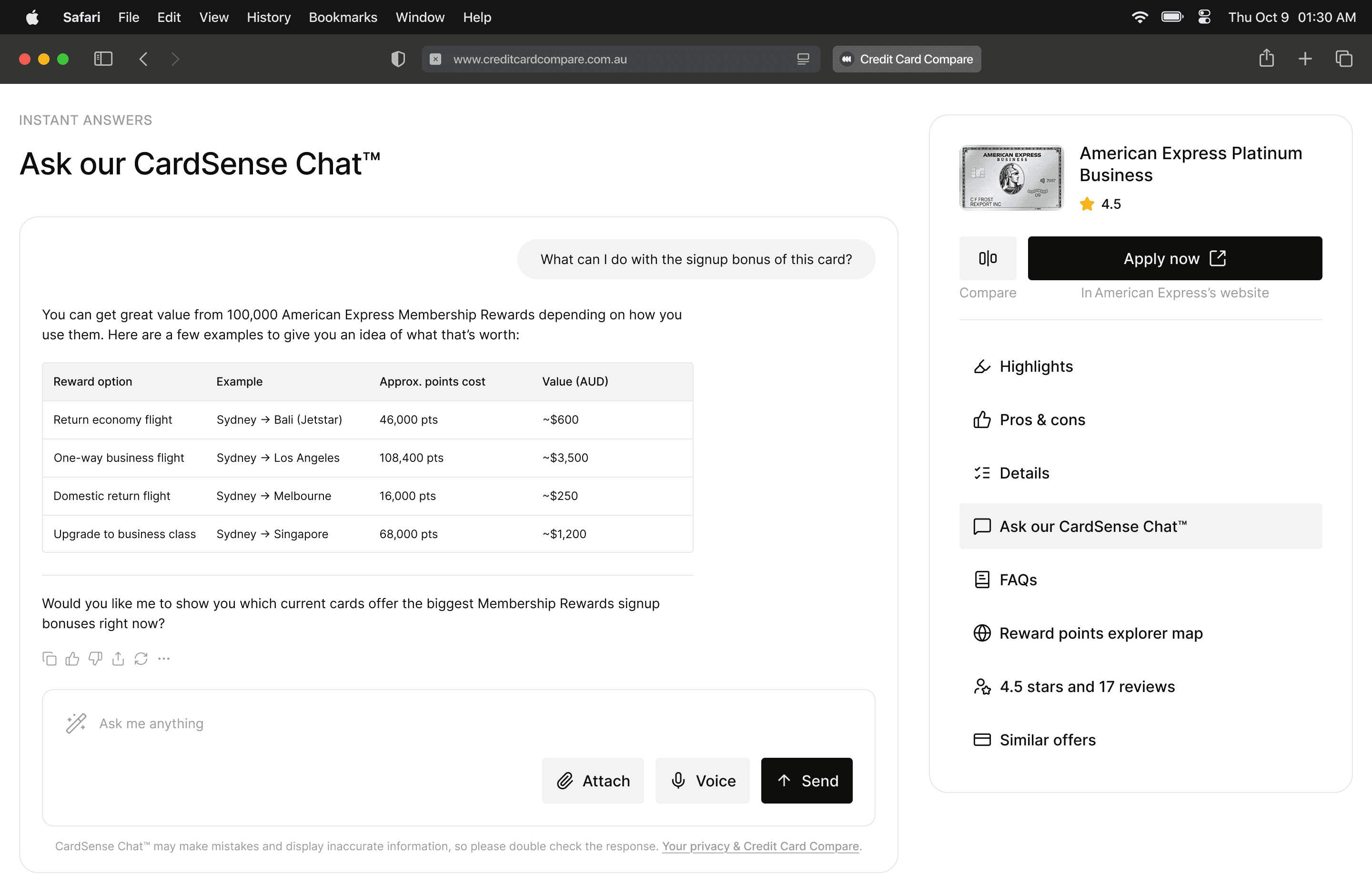
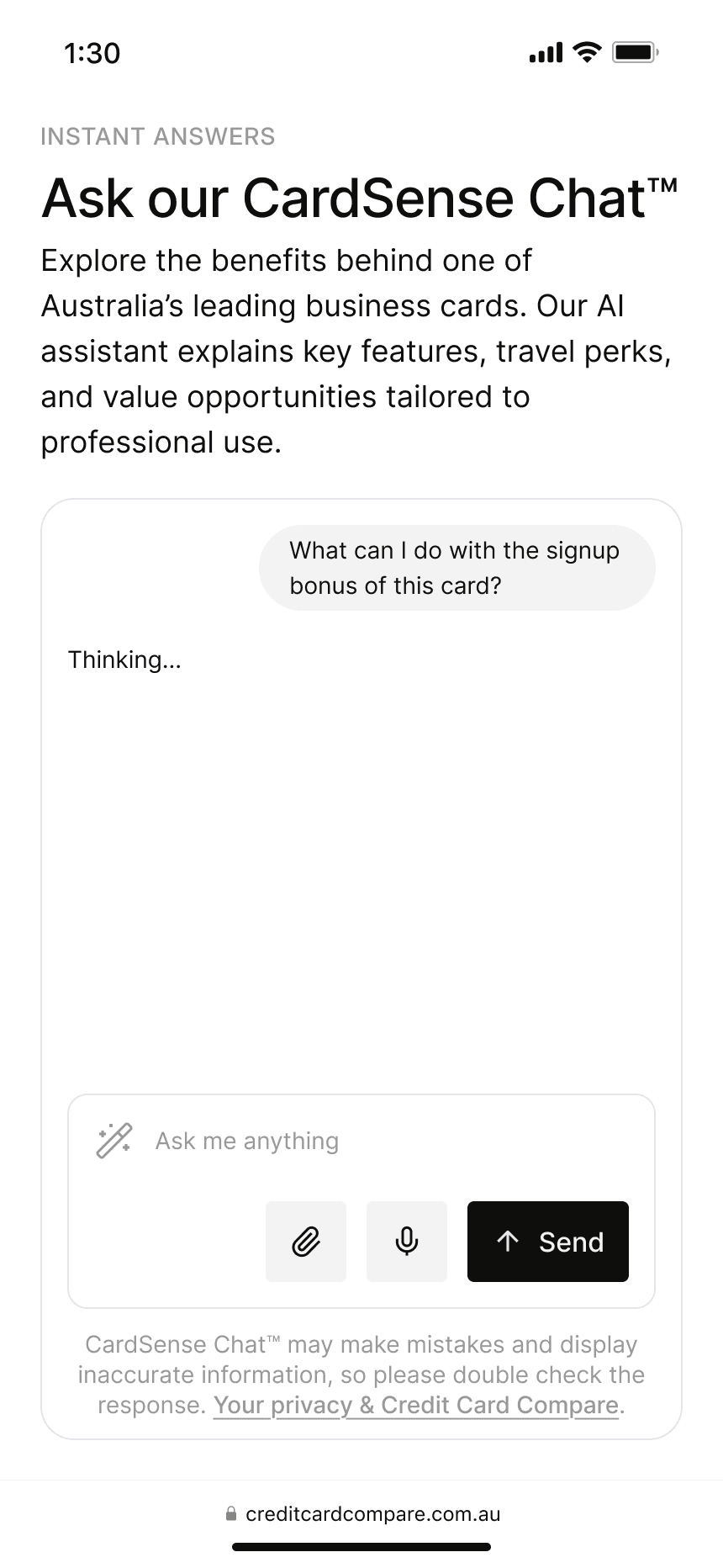
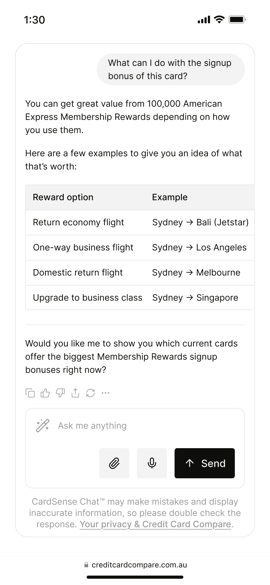
CardSense answers card-specific questions through embedded AI chat before application, scoped narrowly to card details so it stays reliable.
Prototype testing validated the core shift.
The Matchmaker moved users past the "where do I start" problem. They answered a few questions and got options that felt relevant without browsing.
Side-by-side comparison let them see real differences between similar cards instead of switching between tabs.
CardSense caught hesitations right before application, questions about hidden fees or transfer conditions.
Banks and issuers reviewed the curation model during this phase and accepted the trade-offs upfront, so no renegotiation was needed at launch.
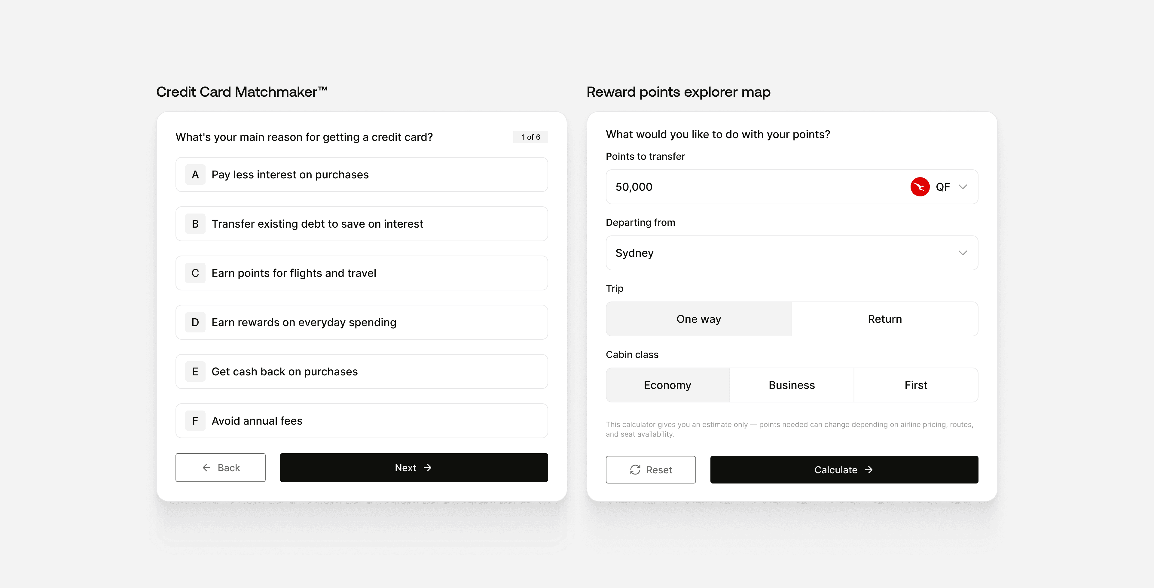
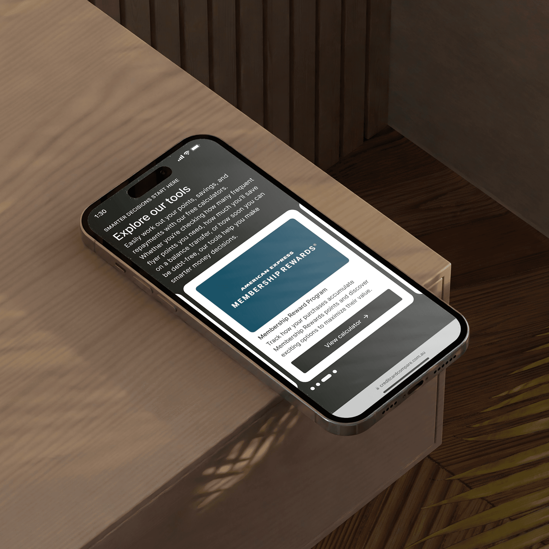
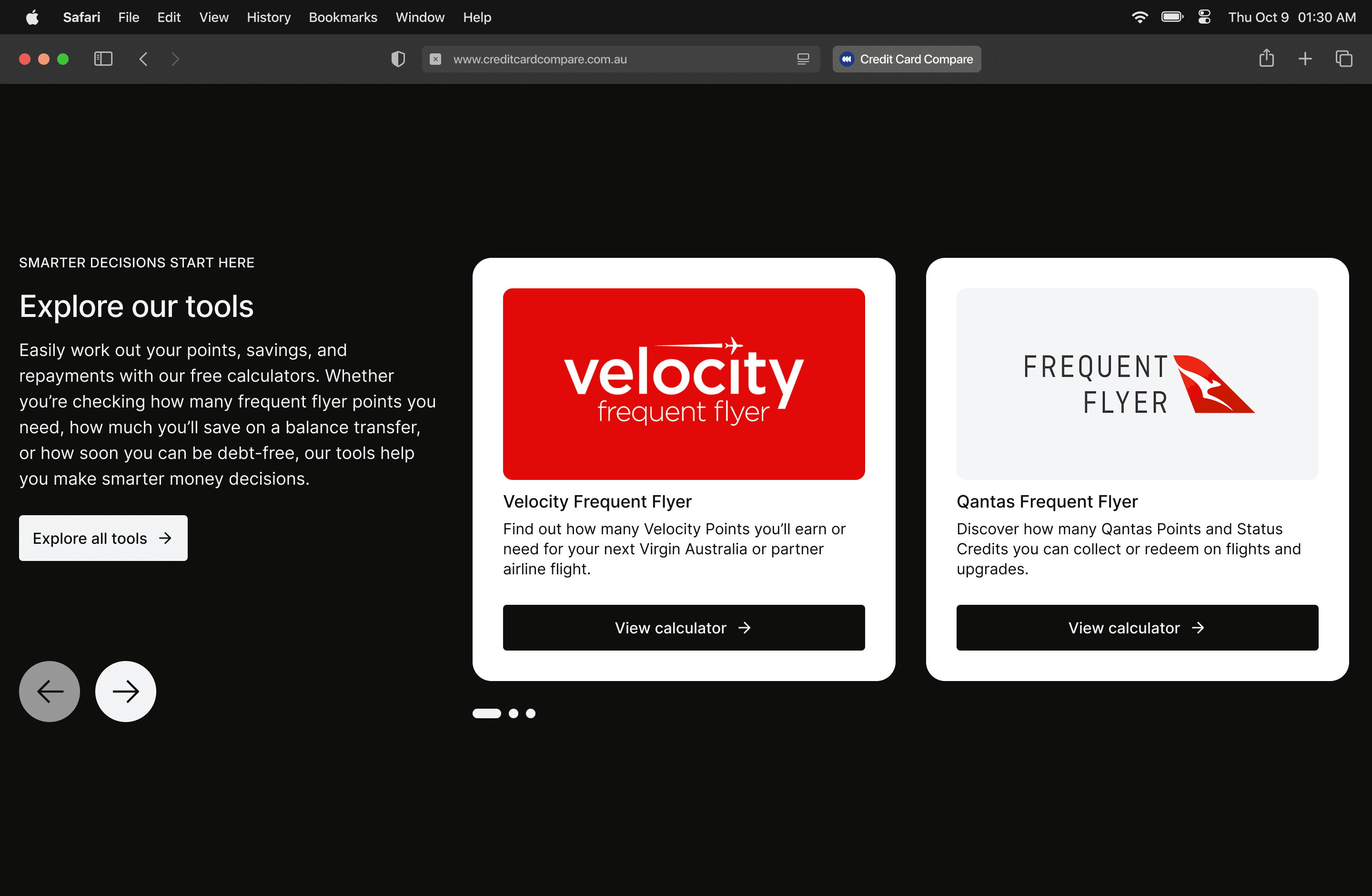
Credit Card Matchmaker™ & Calculators
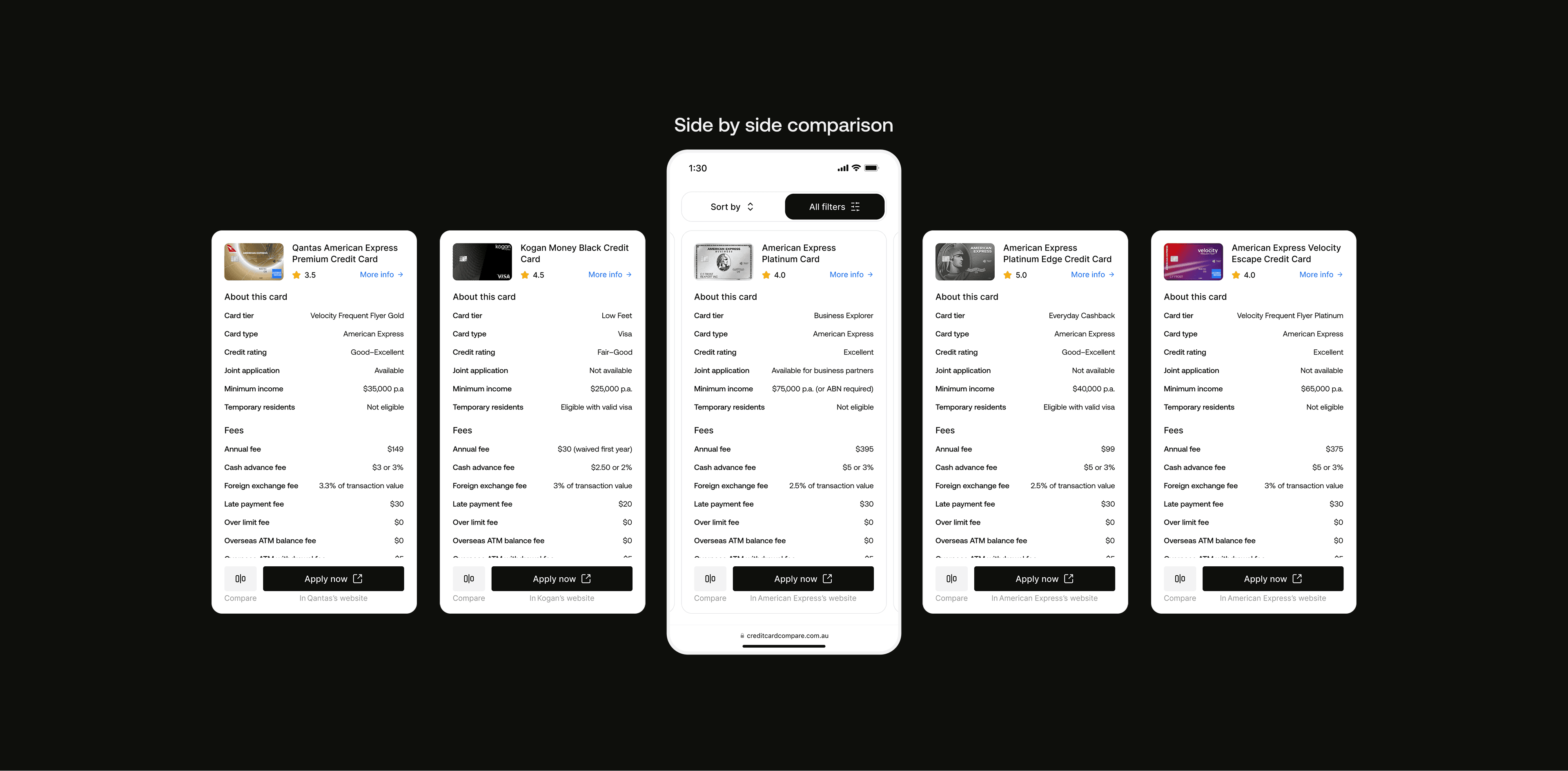
Side by side comparison

CardSense™

Did it work?
In testing, users made decisions faster and with less second-guessing than traditional comparison flows.
Decision time dropped by around 60%.
The hesitation pattern changed. Users stopped stalling mid-list and started moving through stages with a clearer sense of where they were and what came next.
Banks reviewed and accepted the curation approach during testing, which means the product can launch without renegotiating how cards are featured. That kind of alignment usually breaks projects after they ship.
The product is in final development. I'm watching the Matchmaker completion rate and CardSense engagement most closely, because those are the two moments that will show whether the experience actually works in the real world.
~60%
Faster decision time
3
Purpose-built decision tools
200+
Cards funneled to one shortlist

What would I do differently?
I'd have pushed for live traffic earlier. Prototype testing validated the direction, but there's a version of the Matchmaker flow I'm still not certain about, specifically how many questions is too many before users drop off. We made a judgment call in testing. Real data will confirm it or force a revision.
The principle that's staying with me: people struggle with comparison because the experience never helps them decide, not because they lack information. That's obvious in hindsight, but most products in this space are still optimising the wrong thing.
The same approach is now being applied across Finty, adapted for insurance, loans, and other financial products across international markets. Credit Health is part of the same ecosystem, and that case study covers how we approached retention on the same platform.
Understanding where the decision breaks down matters more than showing more data.
Core insight

Supporting Visuals

Logo presentation
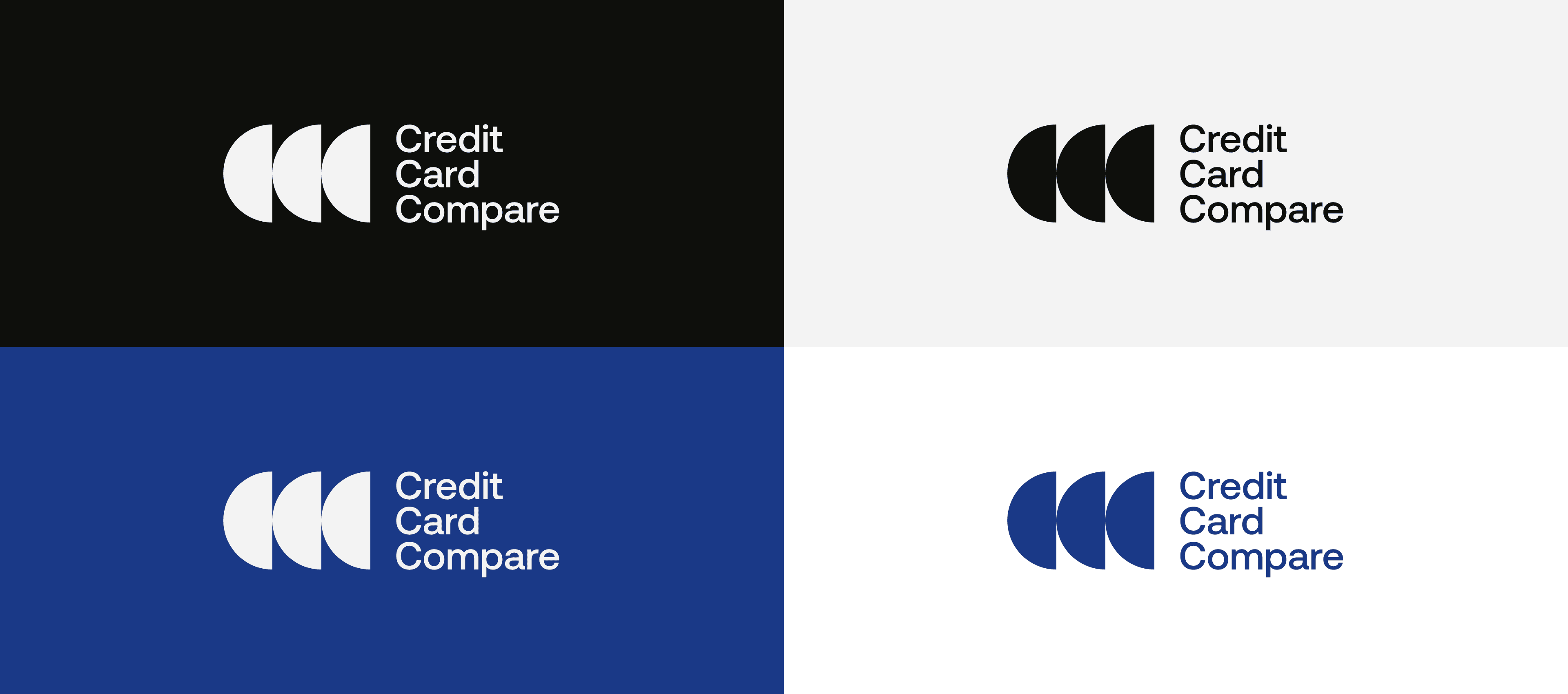
Logo usage

Logo variations
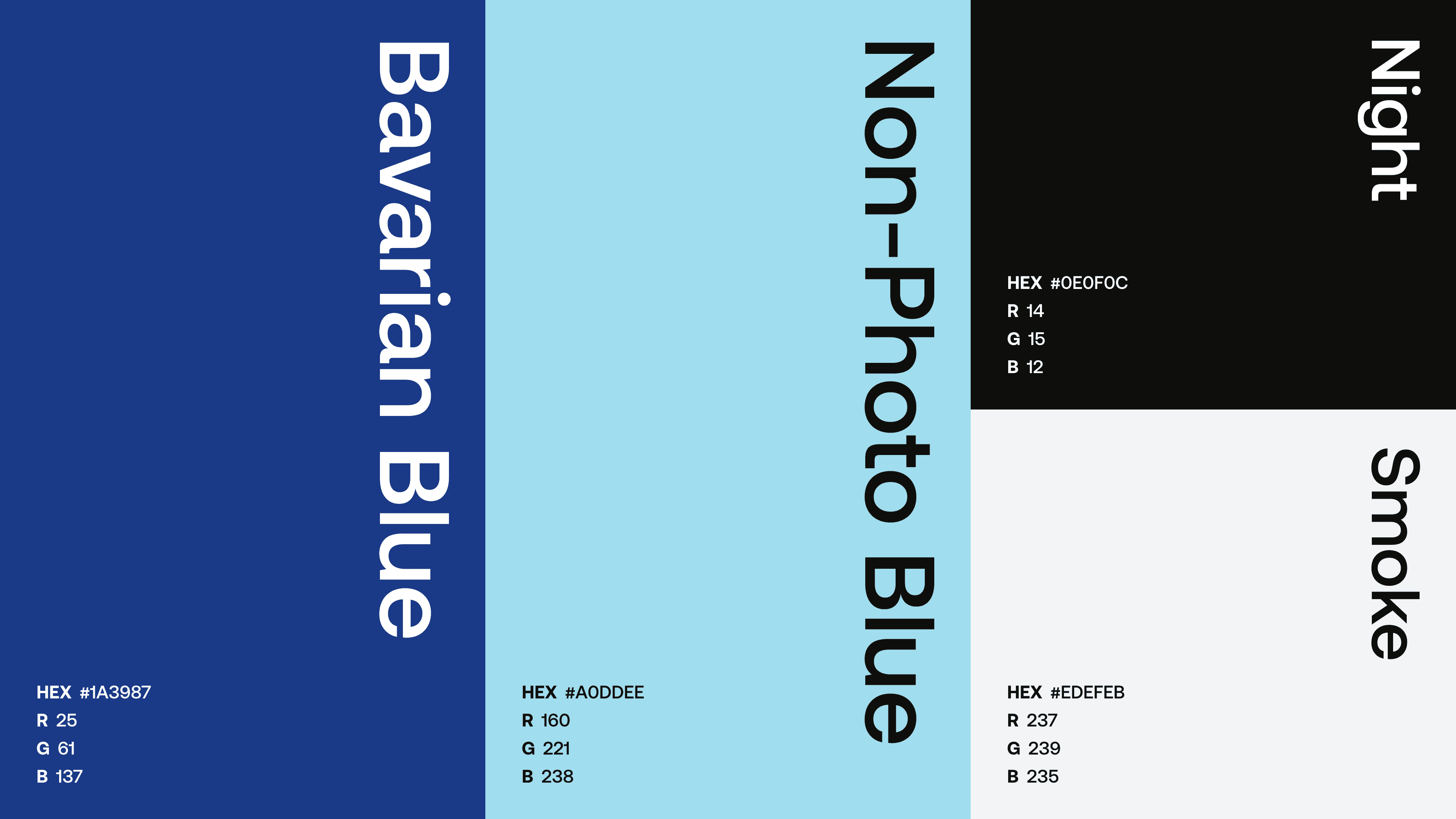
Color palette
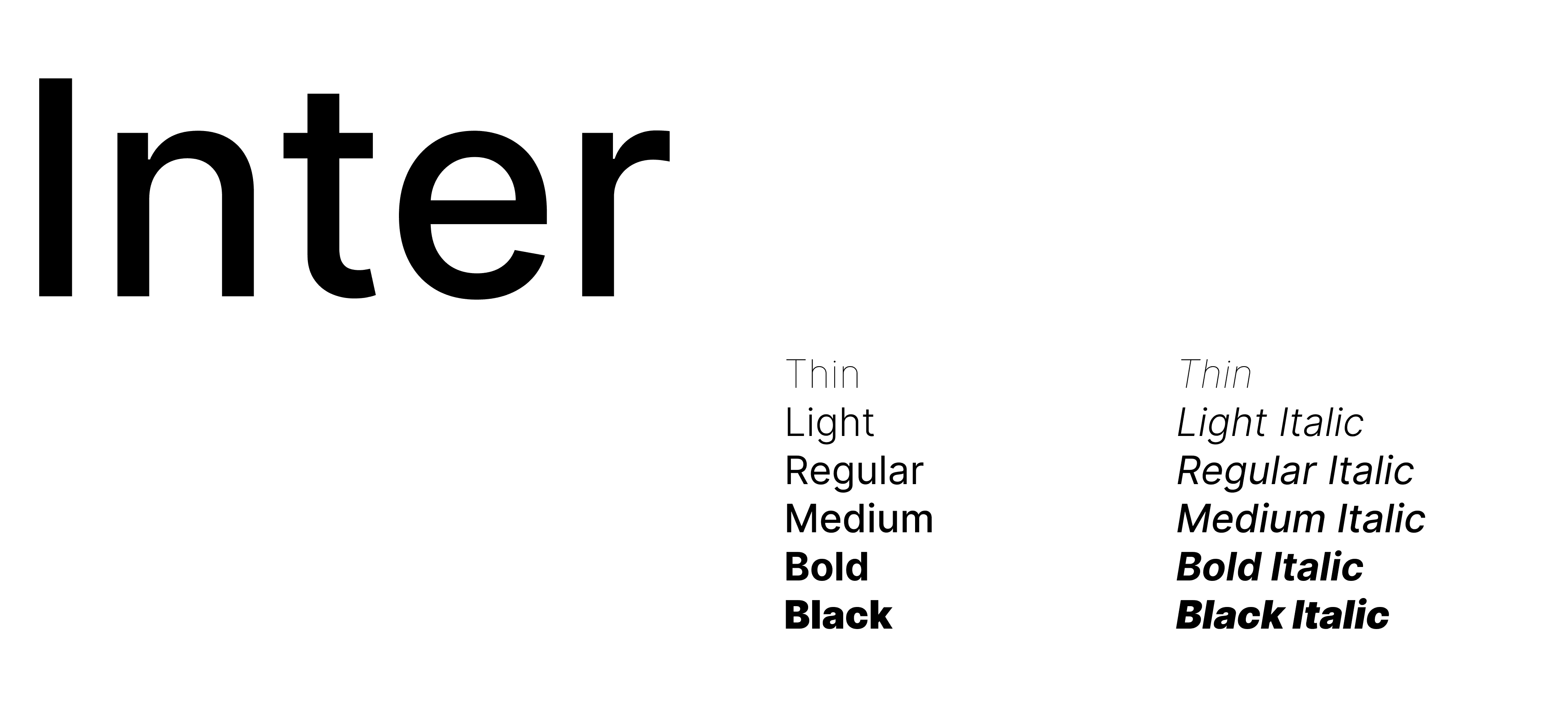
Typography
Typography details
Brandmark & icons

Browser icon

Browser tab

Grid system


