Credit Health

About
Australia's first free credit score app, helping people track, understand, and improve their credit.
Client
Boyd Creative Australia Pty Ltd
Year & duration
2024
-
Ongoing
Role
Senior Product Designer. End-to-end redesign to fix retention and rebuild trust, working directly with the founding team.
Why this case study
Being first to market means nothing if the experience breaks trust. Credit Health launched as Australia's first free credit score app and still lost users. The product wasn't reliable, and no amount of design work was going to fix that without solving the platform problem first. This case study is about diagnosing that, making the case for a foundational change, and rebuilding from there.
At a glance
Identified the scoring provider as the cause of the retention problem, before touching the interface.
Made the case to switch providers before redesigning anything
Redesigned onboarding, score display, and academy content
Faster signup and higher re-engagement validated in prototype testing
100%
Would recommend
87%
Completed without assistance
75%
Would switch apps
Why was it losing users?
Credit Health launched in 2019 as Australia's first free credit score app, but the business model had issues from the start.
Score updates were capped at once a month or would fail entirely, onboarding took too long, and maintenance costs kept rising. People signed up. They didn't stick around.
Being first wasn't enough.


What would bring them back?
Turn credit monitoring into a habit, not a one-time check.
Users needed reasons to return regularly and clear paths to improve their score. The business needed retention that lasted beyond the first login.
A score on its own doesn't change behaviour. What you do with it does.


Was this even a design problem?

How do you redesign trust first?
Each score update needed to explain what changed and why, turning a number into clear next steps users could actually take.
The design treats credit monitoring as an ongoing practice rather than a single moment. People get control over when they check, see what's moving their score, and understand what to do next.
Turn a number into a habit.
The guiding principle

What had to change first?
I identified the scoring provider as the cause of the retention problem. The interface wasn't the problem to solve first.
The user insights I gathered made the case to the founding team to upgrade to a provider with unlimited queries, paying more but solving the biggest pain point: instant on-demand checks instead of failed or capped updates.
I also redesigned three core parts of the experience:
Minimal onboarding (email, password, phone) addressed the second major drop-off point, prioritizing activation over data collection, which reordered the product's early roadmap.
The interface needed to feel professional enough that people would trust it with sensitive information. The previous version didn't, so I invested upfront in polish rather than shipping fast, because how it looks is part of how it works.
Academy content shifted to full-screen videos, podcasts, and articles, giving users reasons to come back between score updates, though richer formats required more resources to maintain.
The two-step onboarding worked. Users signed up quickly with minimal fields, then engaged with the app before being asked for more details.
The "Update score now" button tested well, giving users a sense of ownership over their score rather than waiting for scheduled updates.
Participants described the redesigned interface as more professional, which reinforced the decision to prioritize polish early.
Academy content wasn't part of this testing round but is scoped for development.


Did fixing the foundation work?
In testing, 100% of participants said they'd recommend the experience. 87% completed the flow without any assistance, and 75% said they would switch from their current credit score app once it launched, because it felt more reliable and worth returning to regularly.
The hard decisions on provider and technical foundation were locked in before development started, so there were no costly pivots as the product approached launch.
The team committed to building for retention over short-term signups, which changed how we measured success. Signup volume stopped being the leading metric; engagement depth replaced it.
The product is currently in development.
100%
Would recommend
87%
Completed without assistance
75%
Would switch apps

What did this change for me?
Being first gets you the download. Keeping users is what actually matters.
This project showed me that trust and reliability aren't features you add later. They're the foundation everything else depends on.
That shifted how I think about retention: building something people trust enough to return to matters more than getting them in the door quickly.
Launch will tell us if what worked in testing translates to real retention over time.
Building something people trust enough to return to matters more than getting them in the door.
Core insight

Supporting Visuals

Logo presentation

Logo usage

Logo variations
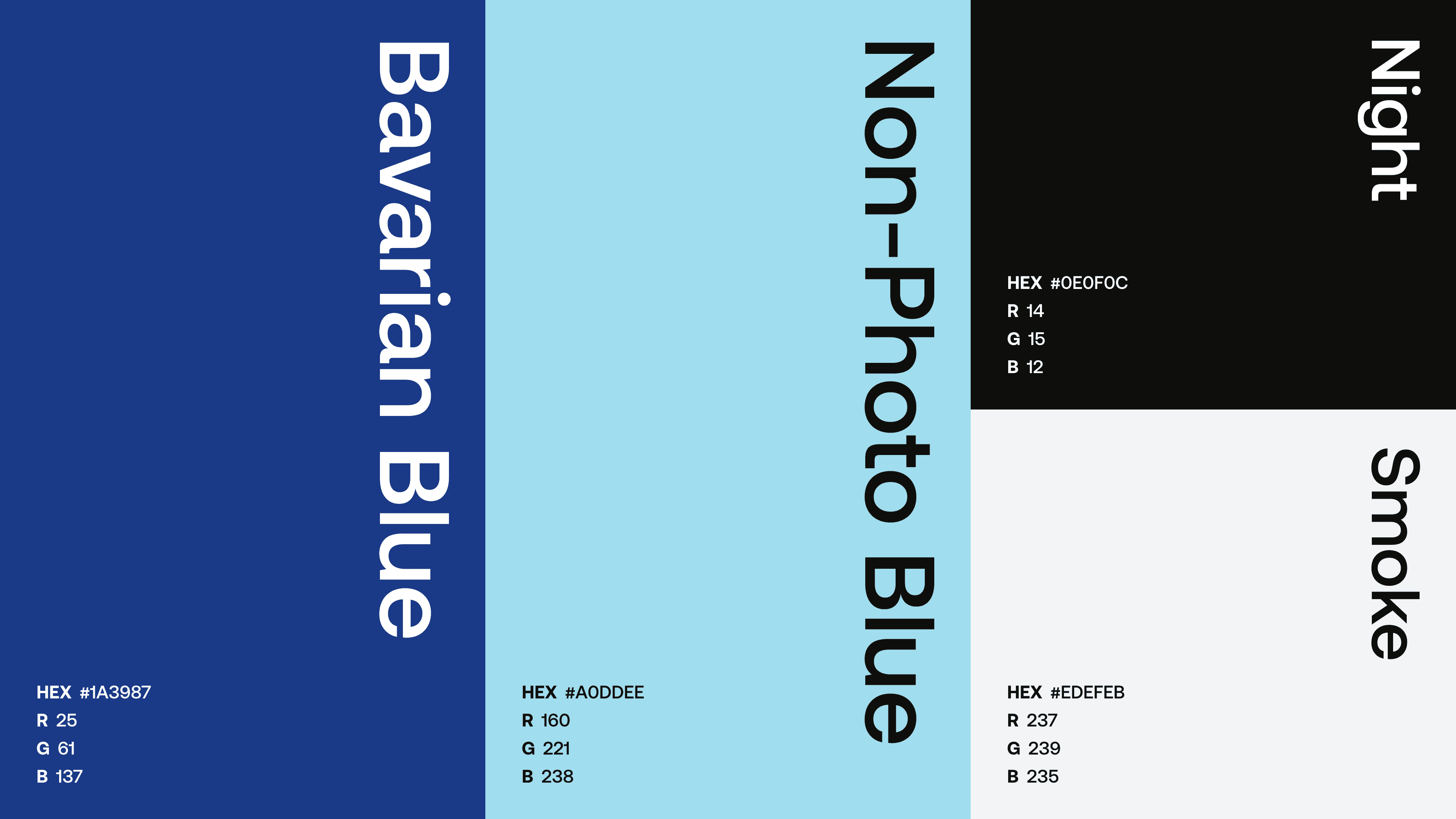
Color palette

Typography

Typography details

Brandmark & icons

Browser icon

Grid system


